
ABOUT THE BRAND AND MY ROLE
Bodum is a globally recognised, design-led brand with a strong heritage and presence across multiple international markets. Operating at this scale requires robust brand governance — structures and systems that ensure consistency across a wide range of touchpoints, from owned platforms to third-party marketplaces like Amazon, while allowing flexibility for local adaptation.
I joined Bodum as a Senior Digital Designer, bringing a focus on editorial storytelling and visual content. Over time, I evolved into a lead role — taking ownership of brand direction, team mentorship, external agency management, and the definition of design systems and guidelines that support day-to-day execution across the organisation.

When I moved into the lead role, the brand lacked the internal structure to operate consistently at scale. Guidelines were incomplete, templates were absent, and working with external agents across different markets created friction and inconsistency in outputs.
Beyond the structural gap, the brand's visual tone needed elevation. Campaign materials felt overly promotional — inconsistent with Bodum's positioning as a design-led, premium brand. And two significant communication challenges had no defined solution: how to tell the brand's sustainability story in a coherent and accessible way, and how to redesign the coffee packaging so it worked better on shelf, scaled across markets, and reduced production complexity.
Solving this meant building the missing structure first, then addressing the two open communication gaps — sustainability storytelling and packaging — each requiring its own system.

ELEVATION & CONSISTENCY
When I took on the lead role, campaign materials lacked a coherent visual tone — outputs felt promotional and inconsistent with the brand's design-led positioning. The fix wasn't a single campaign. It required defining a visual and editorial language that could scale.
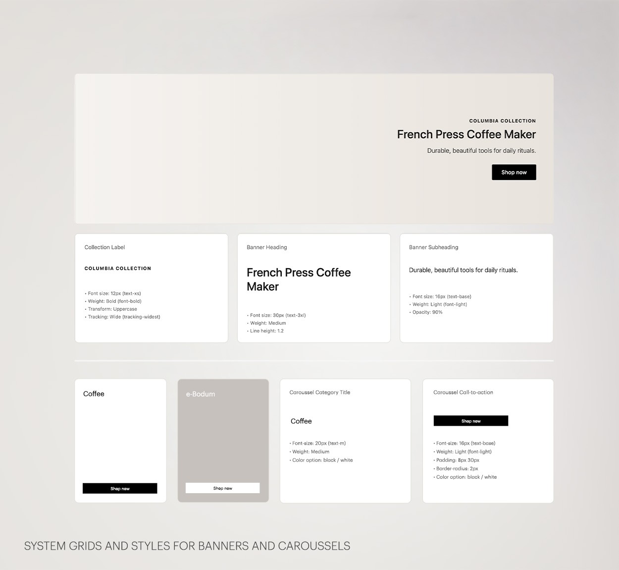
I developed new guidelines and templates for web, newsletters and advertising — establishing a system that teams and external partners could work from consistently. This covered typographic hierarchy, image treatment, layout principles and tone of voice across formats.
The same logic extended to editorial content and homepage storytelling, ensuring that product launches, seasonal campaigns and brand narratives felt coherent whether experienced on the website, in a newsletter, or in a digital ad.


MAKE TASTE NOT WASTE
Bodum had a genuine and long-standing commitment to sustainability — in its production processes, choice of materials, and product philosophy. But that story was fragmented and largely absent from consumer-facing communication. There was no cohesive editorial system to make those values tangible or consistent across channels.
I led the full process from strategy to production: defining the editorial framework and communication pillars, conducting internal interviews to gather and validate information across teams, and managing the briefing and production of external photography and video services, including storyboard development.
The work resulted in three distinct outputs — a designed PDF report, a set of interactive landing pages, and a social media campaign — each adapted to its context and audience while maintaining a consistent narrative and visual language.


A SCALABLE SYSTEM FOR THE SHELF
The brief came from the sales team: customers couldn't easily understand the coffee blend — its strength, origin, or character — from the existing packaging. That information was buried on the back, invisible at the point of decision.
Rather than solving only the legibility problem, I proposed a system redesign. The solution introduced a universal base bag that works across all blends and markets, paired with a printed front label that carries all blend-specific and market-specific information. This eliminated the need to produce separate fully-printed bags per blend and per language, significantly reducing production complexity and waste while making the product clearer and more premium on shelf.
The new packaging is now in market and has received strong feedback from both the sales team and customers.

CONSISTENT BRAND EXPRESSION, EVERY TOUCHPOINT
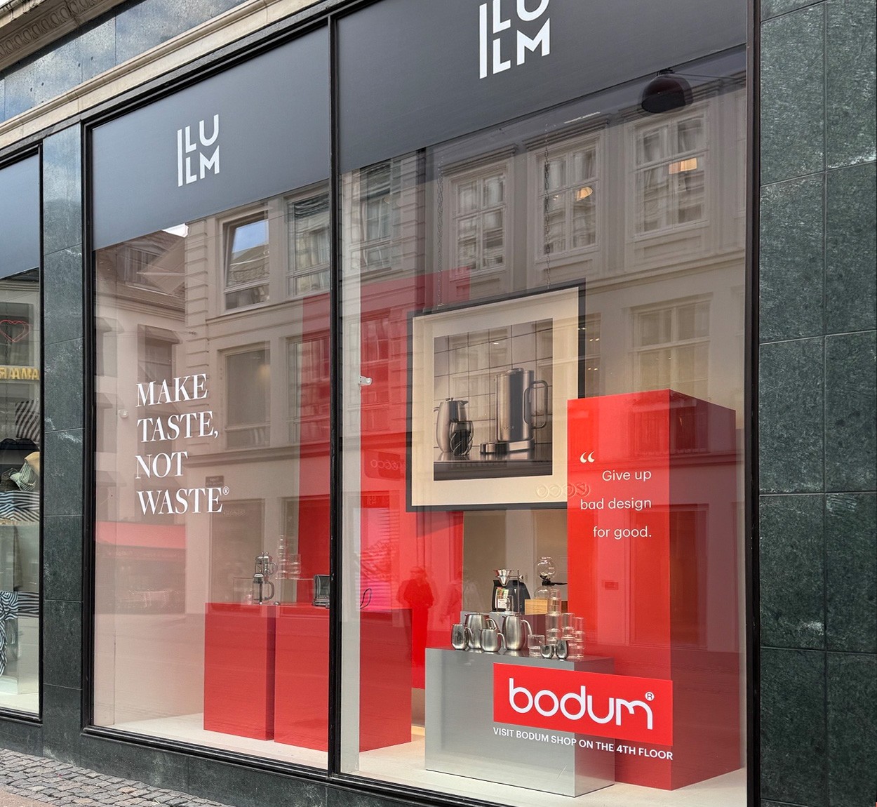
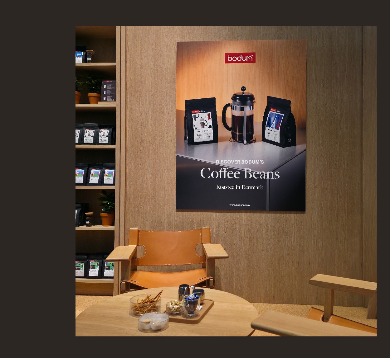

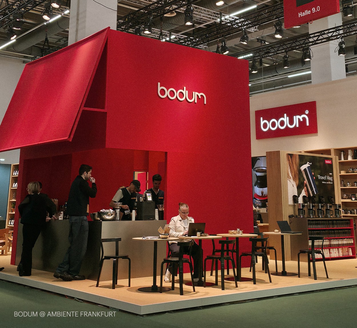
The introduction of scalable brand systems reduced friction across production, translation and market adaptation — enabling faster rollout of digital and editorial content and more consistent brand expression across channels.
Clearer guidelines and templates improved alignment between internal teams and external partners, while the packaging redesign delivered a more legible, premium product presence on shelf with fewer production variants.
